I posted briefly about the basement renovation I was working on at the end of January. This was a quick renovation, turning an unfinished basement into a modern living space in just under 5 weeks from start to finish. (There was just one hitch - the carpet for the living area wasn't installed due to a shipping delay, but the kitchenette and bathroom have been completed.) We worked with a great contractor which made our job easy, as long as we were ready with final decisions and materials when required. Knowing that we wanted a grey and white colour scheme right out of the gate helped drive most of the decisions regarding paint colours, flooring, counter tops, back splash tiles, hardware and fixtures.
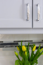
Everything happens in a particular order, and if my memory serves me correctly, we started with selection of the floor tiles. We chose a 12"x24" semi-polished grey techmarble porcelain stone from Olympia Tile. From this we were able pull the paint colours for the cabinetry, pulling Silver Half Dollar and Pewter from the Benjamin Moore paint deck, using the lighter shade on the top cabinetry and the slightly darker shade on the bottom. This paint trick is subtle, but it gives just a bit more weight to the bottom cabinets. You may have noticed that we added doors to the peninsula cabinets from the opposite side which allows easy access to serving pieces, cutlery, and napkins.
We could have gone with a light colour for the counter tops which would be very on trend, but knowing that we wanted to use a white subway tile back splash with a mosaic tile band, it felt more practical to go with a dark shade. We chose Wilsonart's black alicante counter top - yes, it's a laminate - natural stone was not in the homeowner's budget, and we are really pleased with how great the laminate looks. We added a bit of interest to the neutral white subway tile back splash with an accent band of marble and glass mosaic tiles.
I hope by now you've spotted the gorgeous Cosmas hardware that we chose for the cabinet pulls. I felt very strongly about using polished chrome rather than brushed because this element adds a touch of sparkle to the kitchenette. It's easy to forget that this is a basement because it's actually quite bright - the nearby window certainly helps, as do any reflective elements in the space. We kept the finishes consistent, choosing a polished chrome American Standard goose neck faucet, and a polished chrome ELK Lighting pendant over the peninsula.
We used a lot of the same finishes in the new washroom to keep the flow consistent throughout the basement. It was tricky getting shots of the washroom since it's a small space, but it certainly has all of the fundamentals. We continued with the same floor tile and paint colours, but added a few new elements to keep it interesting.
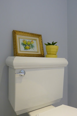
Can we just talk about that toilet for a minute? It's the Memoirs classic design from Kohler and it's a bit odd how much I love it; it has such beautiful architectural detail at the bottom as well as on the tank lid. It's just a bonus that it's very well reviewed. The clean & simple white trash bin cleverly disguises the water line running from the wall to the tank.
With space contraints in this washroom, it made sense to build the vanity area into a nook beside the shower. We opted for some new elements in this area, including a Caesarstone counter top with undermount sink. This would have been a big splurge in the kitchen, but with just a small area to cover in the washroom, it wasn't a total budget buster.
I really pushed for the Moen Boardwalk faucet, I think it's a real stunner and I love the way it bridges both traditional & contemporary design. The modern square lines of the faucet make it the right choice to harmonize with the square sink. We repeated the square motif throughout this small space, from the faucet to the hardware to the soap dish to the trash bin. Good design isn't an accident ;)
This washroom features polished chrome jewels in the faucet, towel bar, cabinet hardware and light fixture. Even the mirror reflects as much light as possible with its mirrored frame. We opted to hang our own mirror (found at Homesense); it didn't cost us anything extra and looks so much better than a builder basic. Don't be afraid to ask your contractor about details like this, it can make a world of difference!!
We took our cue from the kitchen back splash when deciding on tile for the shower walls, only this time we chose a larger scale. It was important to the home owner that the shower be low maintenance (of couse!), so ease of care was an important consideration. We opted for an 8"x20" bright arctic white tile from Olympia which gave us the fresh, clean, modern look of subway tile without all of the grout. The accent tile is the same glass & marble mosaic used for the kitchen back splash, only here we used a wider band to match the scale of the white tiles.
This was the first major project I've taken on that wasn't strictly decorating, and I really enjoyed the experience. It was fun assembling all of the parts together and then seeing the ideas come to life. There were a lot of decisions to be made, and to keep the ball rolling it was important to make those choices quickly and confidently. We made just one misstep (a light fixture that didn't suit the space and was promptly returned), but by and large we were very happy with our choices and consequently we are thrilled with the final results. Let the entertaining begin!!


Hey, I choose the same color for my basement. Grey with white ceiling. I love the Caesarstone top sink. Nice contrast of the top and bottom cabinets. I wasn't so inspired. White tops and light blue bottoms. Looking nice on grey.
ReplyDeleteLooks fabulous Pam! I love the floor tile and all the chrome accents. The square elements in the bathroom are inspired. You're right - good design isn't an accident ;)
ReplyDeleteWhat a fabulous space; it's not easy to make a basement light and bright, but you have done so with flare. Well Done!
ReplyDelete