Saturday, December 7, 2013

One of a Kind Show Favourites

I attend the Christmas One of a Kind Show in Toronto just about every year, and this year was another great event. Last Sunday my sister and I hit the Direct Energy Centre at Exhibition Place and walked the show floor for oh, about 5 hours. There was so much to see that we never wavered, and only sat down for a quick lunch at the halfway point. The show continues until Sunday, December 8th, so if your schedule allows, you should absolutely head downtown to check it out.

I always stop to see what Avril Loreti and Jenna Fenwick (Jenna Rose) have in store; they are both amazing young talents creating the most wonderful textile designs. The One of a Kind Show is one of the best places to pick up unique items to give as gifts, but of course I always manage to find a little something for myself ;) The show's Rising Star section features brand new artisans, and that is where I met the lovely Meghan & Rebecca of Calico Studio. These girls were awesome to speak with and I totally fell in love with their hand painted wool crepe de chine wraps with hand felted edges - so much work, but oh so beautiful!!

It was also in the Rising Star area where I discovered Akai Ceramic Studio. They have the sweetest handmade ceramic pieces, the K Bowl first caught my eye, but I really couldn't help myself when I spotted the pink mini vase. I knew it would look so cute on my bedside table, and it totally does!! I mean have you ever...


Akai Ceramic Studio has an Etsy shop, or if you'd like to pick up a little something as a Christmas gift without the worry of shipping, they will be at the CBC Charity Craft Sale on December 12th and at the Let It Snow Craft Fair in The Annex on December 14th.

Happy Shopping!!

All photos by Pamela Graham for Cherish Toronto.

Sunday, November 24, 2013

White Wash


Although right now I'm heavily into the planning stages for the upcoming trim & paint project in the living and dining areas, there have been other happenings in the new* condo. Just recently both the main bath and the ensuite master bath received a coat of fresh white paint. Although some might hardly notice, for me both rooms feel so much brighter.

The reasons for the paint were twofold. One, after the builders made drywall repairs, they covered the patches in the eggshell finish with flat paint. That is a sad no no :( Two, the walls were a nondescript shade commonly referred to as builder's beige. What I really wanted was for the room to read as pure white.


I chose a white that matched closely with the tiles and sink, and which didn't harbour any blue, green or yellow undertones. This is Para's Whitewash White (P2089-00) and it's the perfect white - it feels so bright and clean! As part of the mini facelift, I added a fabulous chrome hook from Home Depot for guests to hang a bathrobe or towel - something which had been previously overlooked. (Thanks for the tip, Debbie!)


The master ensuite bath received the same Whitewash treatment, and again, I can't get over how clean & fresh it looks. Even though both bathrooms are interior spaces with no windows (common in condominiums), they both seem super bright with this all white scheme.


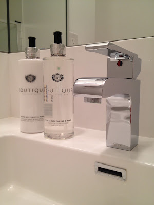
I added a few details to make my ensuite bath feel special. There's something about fancy soaps and lotions that make me feel like I'm staying in five star hotel, and fresh flowers are a real treat! Plus I still love the "Swingerscarnival photo from Red Dot Design.


I made just one little upgrade in this bath wth the addition of a crystal knob on the linen closet door. I won an Elte/Ginger's gift certificate over at Decor Happy this past May and I splurged on this diamond crystal knob. Oh yes, it's all in the details.


*Can I still refer to this place as the "new" condo when I've been living here for almost a year? This coming Thursday is the first anniversary of the official move!

Thursday, November 21, 2013

Dining Dreams

A lot of single folks can't say this, but I eat at least one meal at the dining table every day. Generally that meal is breakfast, and since it's the most important meal of the day, the morning experience should be special. Do you see where I'm going with this? Breakfast is an important meal...Enjoyed at the dining table....In a special space...

Since I'm already planning the moulding and wall trim for the living room, I also need to consider the dining room since the two areas are within the same open space. The idea is to be consistent with colour and trims, but add an element which I've wanted for so long and never had the chance to incorporate into my home: a chinoiserie pattern. I've mentioned my love of chinoiserie fabrics and wallpapers here, here, here and also here.

The colour choice for the walls and trim has been finalized, and I've decided on Marine Bay (P5156-75) from Para Paints:


The living room wall will remain low key, but the dining room wall is going to be a showstopper. I cannot wait to see this come to life!!!!! The plan is to insert two Griffin & Wong silk panels within the inset wall trim. It is going to be un-believable!!


I have yet to get a quote on these two panels, so my fingers are crossed that this will be somewhat affordable... 

Thursday, November 7, 2013

Adding Character to a New Condo

There is another project brewing at home. I've decided that the new condo needs some character, and it's going to get that with some DIY architectural trim and mouldings. Despite being where I spend most of my waking hours while at home, I haven't done anything in the living room. I rolled out the rug, positioned the furniture, plugged in the tv, cable and Wii, and sat down. Done. But as a design blogger, I know this room could be and should be so much better! Here's what I'm working with (excuse the crappy photo - I couldn't get the whole wall in one frame, so it's actually 2 images photoshopped together):


"Bo" to the "ring", right? When I look at this, I'm actually kinda embarrassed by the lack of effort I've made here. Those 9 foot ceilings need to be highlighted, and I'm hoping that the addition of dentil crown moulding at the ceiling and picture frame moulding on the walls will make the height a true feature. A coat of navy blue paint on both wall and trims should make the room sing. Right now it's just so bottom heavy and blah :(

I'm currently in the planning stages, and I'm already finding it tricky to plan the layout. How am I going to work around all of the obstacles on this wall? The door to the master bedroom is on the left, the forced air unit is on the right with the thermostat above, two air vents are set along the top of the wall and a random sprinkler sits in the middle of it all. Ugh. Not to mention that the sprinkler and the thermostat are 100% un-paintable, which means two white blobs on an otherwise navy blue wall.

If you can mentally combine the three images below into one, it will give you a good idea of what I'm trying to create. Navy blue walls, double mouldings, maybe with a dash of gold highlight:

 Above images via Living Etc, House & Home, Lonny Mag.

I found this shallow dentil moulding at Home Depot and I think it would look great along the top of the wall throughout the entire space. Although this moulding is technically intended to be used as a chair rail, it works perfectly here because it will fit in the small three inch gap between the top of the vents and the ceiling:


And here's a quick sketch I put together to illustrate the possible layout of mouldings on the wall and door. I've snuck in a few little upgrades like a new crystal knob on the door to the master bedroom and maybe a NEST thermostat:

  
Anyone have advice about the layout? About the materials? About the installation? I'm all ears!!

Sunday, October 20, 2013

Work In Progress: Front Entry


There is paint on the front door!! Coral paint!! To be precise, this lovely shade is PARA Paints' Ooh Long Tea*. And since I am bound by the rules of condominium living, let me be clear: the paint is strictly on the interior of the front door. With no natural light and a door previously painted dark brown the front entry felt a bit gloomy, so I decided that a light colour would be best to brighten up the space. Now it feels much more welcoming.


I knew I wanted to highlight the coral in the Persian rug at the front entrance, so choosing the colour was the easy part. The tricky part was painting around all of the door hardware - I'm not bad with a roller, but I'm terrible with a brush. A few touch ups may be required :(

I gathered my Nate Berkus pineapple & Jill Rosenwald vase to assemble a coordinating vignette on the tiny entry table. Did you know that the pineapple is an emblem of welcome & hospitality? The fern is a new addition and hopefully will survive in the low light conditions.


By the way, this is where the gold leaf quatrefoil mirrors ended up after I discovered that they wouldn't fit above the bedside tables in the master bedroom. The mirrors also do a great job of making the small entry seem brighter & bigger than it truly is. I'm still mulling over the possibility of adding a fun wallpaper to this area, but until I find just the right pattern that idea is on hold. What do you think so far?


*Thank you to PARA Paints for supplying the paint for this project!!

Monday, October 7, 2013

Up & Coming

There are projects in the works, my friends!!

For starters, there will be colour going up on the doors & walls. I've been in the new condo for nearly 11 months and with the exception of the guest bedroom & the master bedroom, the builder beige walls remain untouched. For the inside of the front door I've chosen a lovely coral, "Ooh Long Tea" from PARA Paints, which will add a fun hit of colour to the entry foyer. The colour was pulled from the front entry rug which I purchased on ebay. Since the entrance sets the tone for the rest of the home, I want to make this area bright and lively. I'm super excited to get this paint project rolling!!


Sunday, October 6, 2013

So September Happened...

"Where does the time go?"

As I age (gracefully, of course), I find myself uttering that phrase more and more. Where has the past month gone? I was sure that after Labour Day I would get back to blogging on a regular basis, and yet here it is October 6th and I'm still lacking posts. I don't pressure myself to create "scheduled posts" or have an "editorial calendar" like some bloggers do, but I do want to keep in touch with everyone who still pops in here looking for an update. Hopefully things will get rolling again now that I have a few fun projects on the horizon!

No excuses, but... September was a busy month. I spent several weekend shifts at work, packing and preparing to move our office & warehouse to a new location. In between all the work I managed to squeeze in some fun stuff. According to my Instagram feed, here is what I did in September:

Enjoyed the TIFF screening of Violette at The Elgin Theatre on Yonge Street.


Celebrated my 43rd birthday with family at El Catrin in The Distillery District.


Toured the Princess Margaret Showhome in Oakville with interior design by Brian Gluckstein. It's so gorgeous!! Have you bought your ticket yet?


Hung out on the set of Canada's Handyman Challenge with Bryan Baeumler, Mike Holmes, Scott McGillivray, Paul Lafrance & Jenn Robertson. Season 3 is coming to HGTV Canada early in 2014.


Attended Blogpodium, a fun and super inspirational conference for bloggers. I had such an amazing time catching up with old friends and meeting new people:


Purchased this stunning wool & silk Ardabil rug at auction. I was so tempted to keep it, but it's for the new office.


Discovered that Ritchies is another great resource for antique rugs. This hand knotted 11' wool runner was an absolute bargain that I couldn't pass up.


Whipped up these sweet little baskets to hold markers and notebooks using fabrics from Tonic Living. I love the fun colour combos! 


So...what have you been up to?

Monday, September 16, 2013

Sarah's Back!!

Hello all,

I just wanted to pop in to let you all know (if you haven't already heard) that Sarah Richardson's new series, "Real Potential" premiers on HGTV Canada this Thursday, September 19th at 9 pm. In this series "Sarah's real estate know-how, expert advice and innovative thinking help buyers see past the one disaster room preventing an offer."

I'll be watching, will you?

Sunday, August 18, 2013

Dining Room Progress

Yesterday was an exciting day chez moi, since it was finally time to have an electrician connect and hang the chandelier above my dining table. I also had a dimmer switch installed for maximum ambiance;) If you're a regular reader, then you may remember an early December post (geez - 8 months ago!?!) where I picked up a glass chandelier for a bargain at a local estate sale. Can I get a drumroll for some "halfway there" progress shots of what's happening in the dining area...


I say "halfway there" because I have yet to make a few key decor decisions. First of all, I'm not not sure what will happen on the blank white wall behind the console. The mirror will stay, but I'm still debating the possibility of paint or wallpaper, perhaps with some trim molding thrown in for good measure. Also, the area is a bit tight, so I'm looking for a round dining table to replace the rectangular one that I brought from my previous home.

But getting back to that chandelier, doesn't it look great? I must say that I'm quite pleased :)

Saturday, August 10, 2013

On The Road Again

It's been hard finding enough time to get much done around the new condo this summer, let alone blog about it. Every summer means more hours at work, and countless hours on Ontario's country roads, traveling between Toronto and our beach stores in Wasaga Beach & Grand Bend.

For lack of any progress on the homefront, I thought I'd leave you with a few Instagram images from my travels. Have a great weekend!


"The real voyage of discovery consists not in seeking new landscapes,
but in having new eyes."

~Marcel Proust

Sunday, August 4, 2013

Using Mirrors Above Bedside Tables

About 9 months ago (wow, time flies!!) I posted a DIY project where my Mom and I covered a pair of quatrefoil mirrors with gold foil. The idea was to mount the mirrors on the wall above each bedside, reflecting the light from the table lamps and adding a bit of sparkle. That idea worked great in the old condo but I hit a snag in the new place - the master bedroom here is about 6" narrower than my previous bedroom, plus the new upholstered bed is 6" wider than the headboard I used to have (which was recovered & relocated to the guest bedroom). If you do the math, you'll calculate that I lost an entire foot which meant that the quatrefoil mirrors no longer fit in the space. Boo :(

I decided to hang the gold foil mirrors in the entryway (still a work in progress) and I've been on the hunt for a new pair of mirrors for the master bedroom ever since. I bought a pair that were too big, and then I bought a pair that were too small, and finally, just like Goldilocks, I found a pair that were just right. Thank goodness HomeSense has an excellent return/exchange policy.

Success!!


There is more space between the mirror and the headboard than there appears, I just couldn't get back far enough to get the right camera angle. I love the shape of these mirrors, and I also love that even the frames are mirrored - I wanted to keep it as simple as possible without introducing any other elements to this wall.

What do you think? Do you like this idea?

Thursday, July 18, 2013

Back in Town

Hello all :) Sorry I've been M.I.A. for awhile. Work has hit high season again and it's gotten a little bit crazy. Last week I was in Los Angeles - buying by day and seeing the sights by night. Today I just wanted to pop in and say "hi", and let you know that I'm still here.

On our last day, we just happened upon the canals in Venice. Such a picturesque setting!!


See you soon!

Monday, July 1, 2013

Wasn't That a Party?

As Canada Day draws to a close, I trust that you all had an amazing holiday weekend. Do we really have to go back to work tomorrow?

Photo by Me :)

Sunday, June 30, 2013

The Great Canadian Outdoors

I grew up in the Kawarthas, just outside of Peterborough. My family never spent summer weekends at the cottage because we lived in cottage country all year 'round. Our house overlooked Chemong Lake and we had a good sized back yard with a set of swings, a vegetable garden and stone barbeque that my Dad made.

 
View of Chemong Lake from our house, circa 1971.

Fast forward about 40 years. Now I'm living life as a city girl with a 4' x 10' balcony as my own personal slice of the outdoors. Not bad, considering this balcony is almost 25% bigger than my previous one. There are several parks nearby with plenty of room to roam, but some mornings I just want to step outside wearing pj's and with a cup of coffee in hand.


Here on the new balcony, I'm using the same ceramic garden stool, yellow urns and woven chairs that I had at the old place (you can see posts about the old balcony here & here), but there are some new additions. This year I invested in a strand of lights, an inexpensive rug and some real greenery.


I picked up two dwarf globe cedars at Home Depot this spring and planted them in the yellow urns. They seem to get just the right amount of moisture from Mother Nature's regular watering ;) The yellow rug is from HomeSense and it ties in perfectly with the colour palette.


I love the string of outdoor lights! Their warm glow gives the balcony so much ambiance in the evening hours. Inviting, isn't it?

So, how do you enjoy the Great Canadian Outdoors?

Saturday, June 29, 2013

Happy Canada Day Weekend

To all my fellow Canadians, I wish you a happy, happy Canada Day weekend! I'm sure 97% of you are either on the road to the cottage or have already arrived there, but I'm also pretty sure that most still have internet access and are reading this outdoors with a beverage in hand.

In celebration of the national holiday, Lia Fagan of Mod Pieces is running her annual "Shop Like a Designer" sale, which means this weekend (June 28th to July 1st) everyone receives the trade discount of 25% off regular pricing. Just use the coupon code "OHCANADA" at checkout.


Lia started her business, Mod Pieces, by refurbishing vintage lamps and she is the "go-to" girl for custom shades. In fact, Lia created the custom size shades for the ceramic lily lamps in my guest bedroom:


Lia has recently added throw pillows to her design repertoire, and she has such a great eye for fun patterns and colours. I'll bet a few of these would look great on your couch!

I love this classic black & white combo:


This chartreuse & blue combo is perfect for summer decor:


Mod Pieces has two of these lamps available, "The Lilith Twins". They're so Mad Men:


The Mod Pieces "Shop Like a Designer" sale is on now and runs through midnight on Canada Day (Monday, July 1st).  Happy shopping!!