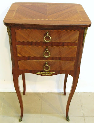
I came up with an idea for the front entry of the new condo while lying in bed last night wondering what to do with this Louis XV style lamp table I bought at auction. Estimated to sell for $600 to $800, it was a bargain at $150 buckeroos. I mean, check it out, people, it's inlaid and cross banded rosewood for crying out loud!
Photo courtesy of Empire Auctions Toronto
So I started thinking that this table would be just the right size for the two foot entry wall, and the three tiny drawers would be perfect for dropping keys and hiding miscellaneous clutter. With my thrifted Syroco mirror hanging above, it would make a great little entry vignette.
So what to do...what to do...?
Lightbulb moment!! Chevron!!

Using the table top as inspiration (note the pattern), I could paint one zig and one zag of pink and white on the wall to give the entry a modern edge. Can you picture it? Here, let me help you out:


I liked your light-bulb moment. The pattern really brings a youthful element to the space. I like the mix of traditional with a more modern background.
ReplyDeleteGlad to hear you like it, Robert. That's one 'yea' vote...anyone else ready to weigh in?
ReplyDeleteOk! I was going to say that I was not crazy for the look but I kept going back to look at the picture. The more I kept looking the more I was liking. I say "go for it" I think it would be a fun twist.
ReplyDeleteThanks, Cindy!! Two 'yea' votes!! Yay!!
ReplyDeleteI like the chevron but I might go for a colour other than pink. It doesn't do much to bring out the beautiful wood tones.
ReplyDeleteGood point about the colour - thanks for bringing that to my attention, Jen. I hadn't gotten that far along in my train of thought ;-)
ReplyDeleteMaybe with soft grey or navy blue? I like the chevron too!
ReplyDeleteI'm thinking of navy...since the gallery wall at the end of the hall beyond will also be navy, it would make sense to use the same colour scheme.
ReplyDeleteI agree about the colour - a navy would look great. WIth these pieces of furniture/wood tones you might get a quasi-historic look with a navy (not sure if that's also still too traditional for you...). What about black chevron? For me there's something both traditional (which will unify your choice of furniture) and modern (since it's so bold!) about black chevron. I like the navy too though.
ReplyDeleteLiking it...in a grey chevron for me
ReplyDeletePerfect - love the combination of modern and traditional. I personally couldn't do the pink, but it that's your go to colour then go for it.
ReplyDeleteI love the idea of the chevron, but not too keen on the pink. How about yellow? Or black and white?
ReplyDeleteThe table is amazing and I think it will look perfect as an entry piece.
@Manal, @designwali, @Grace, @Carol-Anne So far opinions have been favourable towards the chevron, but not so much for the pink. I'm so happy to have gotten such great feedback, and I'm definitely starting to lean towards a navy chevron for the entry wall.
ReplyDeleteThe navy chevron gives a nautical feel, which I am not crazy about. It also reads more traditional than the fuschia I say "go for the fuschia". It's a nice contrast. I love the idea of the table, the mirror and the chevron!!
ReplyDeleteI'm casting my vote for the Navy...beautiful contrast with those wood tones.
ReplyDelete