Showing posts with label Basement. Show all posts

Monday, March 7, 2016

A Brand New Space: Grey & White Basement Renovation


I posted briefly about the basement renovation I was working on at the end of January. This was a quick renovation, turning an unfinished basement into a modern living space in just under 5 weeks from start to finish. (There was just one hitch - the carpet for the living area wasn't installed due to a shipping delay, but the kitchenette and bathroom have been completed.) We worked with a great contractor which made our job easy, as long as we were ready with final decisions and materials when required. Knowing that we wanted a grey and white colour scheme right out of the gate helped drive most of the decisions regarding paint colours, flooring, counter tops, back splash tiles, hardware and fixtures.


Everything happens in a particular order, and if my memory serves me correctly, we started with selection of the floor tiles. We chose a 12"x24" semi-polished grey techmarble porcelain stone from Olympia Tile. From this we were able pull the paint colours for the cabinetry, pulling Silver Half Dollar and Pewter from the Benjamin Moore paint deck, using the lighter shade on the top cabinetry and the slightly darker shade on the bottom. This paint trick is subtle, but it gives just a bit more weight to the bottom cabinets. You may have noticed that we added doors to the peninsula cabinets from the opposite side which allows easy access to serving pieces, cutlery, and napkins.


We could have gone with a light colour for the counter tops which would be very on trend, but knowing that we wanted to use a white subway tile back splash with a mosaic tile band, it felt more practical to go with a dark shade. We chose Wilsonart's black alicante counter top - yes, it's a laminate - natural stone was not in the homeowner's budget, and we are really pleased with how great the laminate looks. We added a bit of interest to the neutral white subway tile back splash with an accent band of marble and glass mosaic tiles.


I hope by now you've spotted the gorgeous Cosmas hardware that we chose for the cabinet pulls. I felt very strongly about using polished chrome rather than brushed because this element adds a touch of sparkle to the kitchenette. It's easy to forget that this is a basement because it's actually quite bright - the nearby window certainly helps, as do any reflective elements in the space. We kept the finishes consistent, choosing a polished chrome American Standard goose neck faucet, and a polished chrome ELK Lighting pendant over the peninsula. 


We used a lot of the same finishes in the new washroom to keep the flow consistent throughout the basement. It was tricky getting shots of the washroom since it's a small space, but it certainly has all of the fundamentals. We continued with the same floor tile and paint colours, but added a few new elements to keep it interesting.


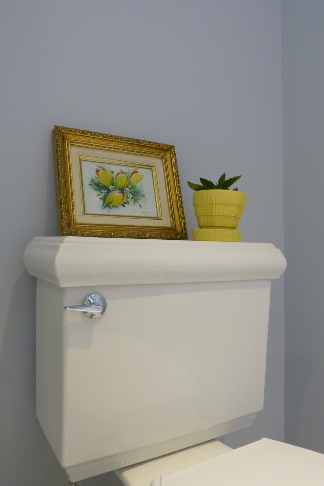
Can we just talk about that toilet for a minute? It's the Memoirs classic design from Kohler and it's a bit odd how much I love it; it has such beautiful architectural detail at the bottom as well as on the tank lid. It's just a bonus that it's very well reviewed. The clean & simple white trash bin cleverly disguises the water line running from the wall to the tank.


With space contraints in this washroom, it made sense to build the vanity area into a nook beside the shower. We opted for some new elements in this area, including a Caesarstone counter top with undermount sink. This would have been a big splurge in the kitchen, but with just a small area to cover in the washroom, it wasn't a total budget buster.


I really pushed for the Moen Boardwalk faucet, I think it's a real stunner and I love the way it bridges both traditional & contemporary design. The modern square lines of the faucet make it the right choice to harmonize with the square sink. We repeated the square motif throughout this small space, from the faucet to the hardware to the soap dish to the trash bin. Good design isn't an accident ;)
 

This washroom features polished chrome jewels in the faucet, towel bar, cabinet hardware and light fixture. Even the mirror reflects as much light as possible with its mirrored frame. We opted to hang our own mirror (found at Homesense); it didn't cost us anything extra and looks so much better than a builder basic. Don't be afraid to ask your contractor about details like this, it can make a world of difference!! 


We took our cue from the kitchen back splash when deciding on tile for the shower walls, only this time we chose a larger scale. It was important to the home owner that the shower be low maintenance (of couse!), so ease of care was an important consideration. We opted for an 8"x20" bright arctic white tile from Olympia which gave us the fresh, clean, modern look of subway tile without all of the grout. The accent tile is the same glass & marble mosaic used for the kitchen back splash, only here we used a wider band to match the scale of the white tiles.


This was the first major project I've taken on that wasn't strictly decorating, and I really enjoyed the experience. It was fun assembling all of the parts together and then seeing the ideas come to life. There were a lot of decisions to be made, and to keep the ball rolling it was important to make those choices quickly and confidently. We made just one misstep (a light fixture that didn't suit the space and was promptly returned), but by and large we were very happy with our choices and consequently we are thrilled with the final results. Let the entertaining begin!!

Wednesday, January 27, 2016

Basement Reno: So Many Decisions!!

A friend of mine came to me seeking input regarding the design of his home's unfinished basement. After living in the home for many years, it was time to finish the basement and gain much needed space to entertain and hang out. The basement was pretty much a blank slate: think exposed insulation and ceiling joists. It was the perfect opportunity to customize unused space for the homeowner's needs.

After considering how his family would use the space, it was decided that they would need a kitchenette, a full washroom and a large open area with the possibility of converting some of that open space to a bedroom in the future. Since I'm not a trained designer, I sketched out a few rough ideas but left the major decisions to my friend and his contractor. They worked together to come up with a design plan and a budget, and work started almost right away. Feeling pressure to make decisions, we soon found ourselves spending hours choosing countertops, tiles and paint colours. This is my Instagram capture of what we finalized:


The kitchen backsplash will be a classic 3"x6" arctic white subway tile, which we will accent with a 4" band of the glass & marble mosaic tile. The shower wall in the bath will have a similar look, but with a larger 8"x20" arctic white tile (less grout = less to clean) with a 6" accent band and a 2"x2" dark grey porcelain on the shower floor. Floors in both the kitchen and the bathroom will be the veined grey porcelain Techmarble in a semi-polished finish (love this tile - it has the look of marble without the expense). The bathroom will feature a dark grey Caesarstone counter top with integrated white sink which should tie in perfectly with the accent band in the shower. In the kitchen, all upper cabinets will be painted Benjamin Moore's Silver Half Dollar (2121-40), while the lower cabinets will be a slightly darker Pewter (2121-30). Painting has already happened on the walls and we are happy that we chose Silver Half Dollar, it's a light grey which works really well in a basement with very little natural light.

This past week we chose faucets and cabinet hardware for both the kitchen and bath, and this renovation should wrap up within a few weeks. Here are the mood boards for both the kitchen and the bath:


1. Benjamin Moore Silver Half Dollar (2121-40)
2. Benjamin Moore Pewter (2121-30)
3. American Standard Fairbury Faucet
4. Wilsonart Black Laminate Countertop in Black Alicante
5. Cosmas 96mm Polished Chrome Pull
6. Techmarble Semi Polished Grey Floor Tile 12"x24"
7. Frigidaire Stainless Steel Refrigerator
8. Glass & Marble Accent Mosaic Tile
9. Bright Arctic White Subway Tile 3" x 6"


1. Benjamin Moore Silver Half Dollar (2121-40)
2. Benjamin Moore Pewter (2121-30)
3. Moen Boardwalk Faucet
4. Caesarstone Countertop in Cement (2003)
5. Hickory Hardware 96mm Polished Chrome Pull
6. Techmarble Semi Polished Grey Floor Tile 12"x 24"
7. Kohler Memoirs Classic Toilet
8. Glass & Marble Accent Mosaic Tile
9. Bright Arctic White Subway Tile 8" x 20"
10. Nuvo Parker Polished Chrome 2 Light Vanity Fixture

Wednesday, March 16, 2011

Sarah 101: Episode 11 Clutter Free Basement

This Tuesday the 11th episode of Sarah 101 aired on HGTV, which means the series will soon be drawing to a close. I will definitely miss my Tuesday night highlight!! But not to worry, there are two more episodes before it's a wrap! Tonight Sarah and Tommy tackled an 60 foot long open plan basement, converting the space from chaotic and disorganized to clutter free and multifunctional. The plan was to create a division of space which could accommodate several functions: storage, laundry, lounging and play.

Tommy and Sarah started at the fabric store, selecting a red scheme which would add charm and personality to the basement. A bold ikat fabric, an embroidered trellis pattern, a red & white stripe and a bold brush stroke print would all combine to create a lively colour story.


The basic building blocks of the room were purely neutral - a fresh coat of cream paint on the walls and bulkheads, durable broadloom on the floors throughout, a light oak finish on the storage cabinets, and a linen slipcover on the sectional sofa.


With duct work running through basements, bulkheads are a necessary evil resulting in a combination of high and low ceilings, making it difficult to use standard storage cabinets. Sarah decided that kitchen cabinetry would be the most versatile option, combining base and upper cabinets with pantry cabinets, creating an abundance of storage space.


In the secluded laundry area, a butcher block island with drawers and shelves provides even more storage while serving as a folding station and pickup zone.


In addition to the built in cabinets, Sarah & Tommy chose several key pieces to adequately furnish the lounge area: a sectional couch, an upholstered chair, a media unit, two vintage side tables, a coffee table, and a console table. Sarah's advice: Buy only what you need - more furniture would have crowded this space.


When using curtains to section off an area such as this kids playroom, use cup mounts on either end and a short center support. Fewer gaps around the edges and along the top make the curtain feel more like a room divider.


More sage Sarah Richardson advice: Use full height drapery on small basement windows. This creates the illusion of being in above ground room, especially when the drapes are closed. Family photos matted in "really red" and professionally framed provide affordable art.


What did you think of this clutter free basement?

All photos courtesy of HGTV Canada.

Friday, October 30, 2009

Treatments for Basement Windows

Just recently, a reader (aka my Uncle Garry) asked for my opinion about what type of treatment would work best for his newly finished basement windows. These windows swing up and latch or the window can be completely removed. This means no blinds or other contraptions within the casing which would interfere with the mechanism.

Hmmm...while I'm thinking, take a look for yourself (note the beautiful millwork!!):


Wall Colour: Benjamin Moore Wheat Sheaf CC-220


These are my top 2 suggestions for window treatments:

(1) Plantation Shutters.


Image courtesy of Shutterland.com

Pros:
Clean and simple aesthetic.
Good amount of light when louvers are open.
Complete privacy when closed.
Light dusting required to clean.
Can be stained to match the millwork.

Cons:
May hide the beauty of the existing millwork.
Expensive due to custom work required.

2) Floor Length Drapery Panels.


Images courtesy of Invudraperyco.com

Pros:
Floor length drapes create the illusion of a higher ceiling.
Drapes add warmth to the space.
Maximum amount of light when panels are stacked back to sides.
Total privacy when lined panels are closed.
Neutral colour blends with wall colour for continuity.
Affordable since custom work not required (except hemming).

Cons:
Curtains will require vacuuming & occasional laundering.

Final Thoughts

The most difficult part of offering an opinion is that the advice seeker often does not share the opinions of the advice giver. In light of this, I have developed a backup option:

3) Window Film


Image courtesy of Remlor.com

Pros:
Provides privacy.
Inexpensive.
Easy to install.

Cons:
Not pretty.